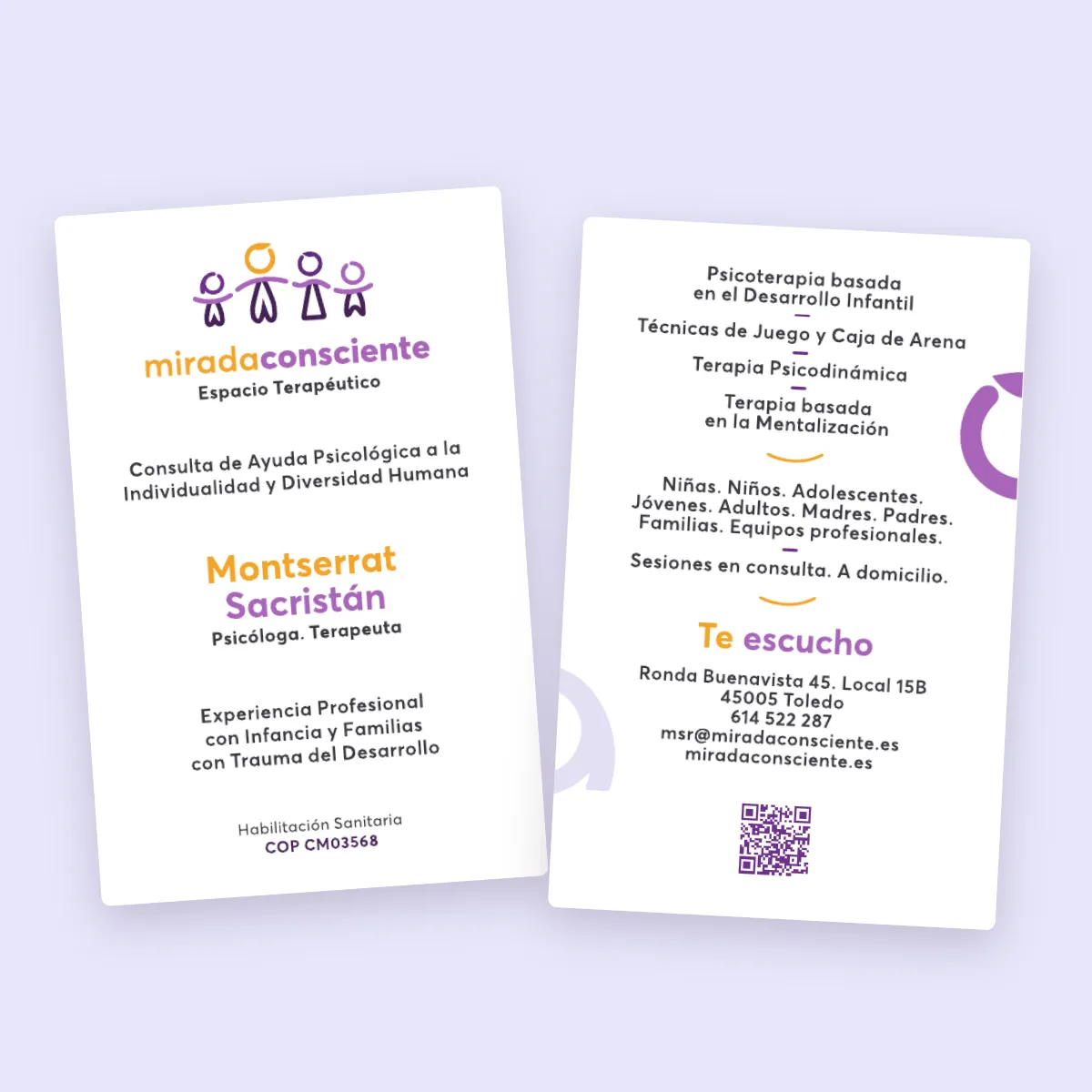
Mirada Consciente is the private practice of Montserrat Sacristán, a psychologist in Toledo who works with children, adolescents and their parents. Her focus is developmental trauma and attachment, and in the room she works with play and with the sand tray, where a child builds what it can’t yet say.
The name was hers. Everything that makes it visible is mine: the research, the logo, the colours, the type, the copy, the website, the path from a first search to a first appointment, and the measuring afterwards.
Who is actually looking
The person who finds a child psychologist is almost never the child. It’s a parent, often late in the evening, on a phone, with a worry they can’t name yet. That parent doesn’t search for “MBT-A” or “sand tray therapy”. They search for what they see at home: a child who stopped sleeping, a teenager who stopped talking.
So the research started there. I mapped four practices in and around Toledo and found the same split everywhere. The specialised ones sounded clinical and cold, the warm ones sounded like everybody else. Nobody held the corner where a practice is both specialised and warm, and that corner became the brief.
Two more readers shaped the site. Teenagers who search on their own get one quiet line that says they can write directly. Schools and doctors who refer families get the credentials early, stated exactly, because a referral is a professional putting their own name on the line.
From the eye to four figures
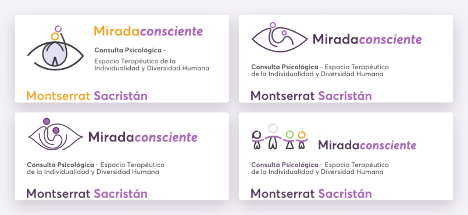
The client’s old card carried an eye. Round one took the eye seriously, in several versions, and next to it tried a different idea: four figures holding hands.
The eye is the obvious symbol for a practice called Mirada, and that’s its problem. Psychology logos are full of eyes. And for a child who is brought to therapy, being looked at is the uncomfortable part. Adults look at you at school, at home, now in a consulting room.
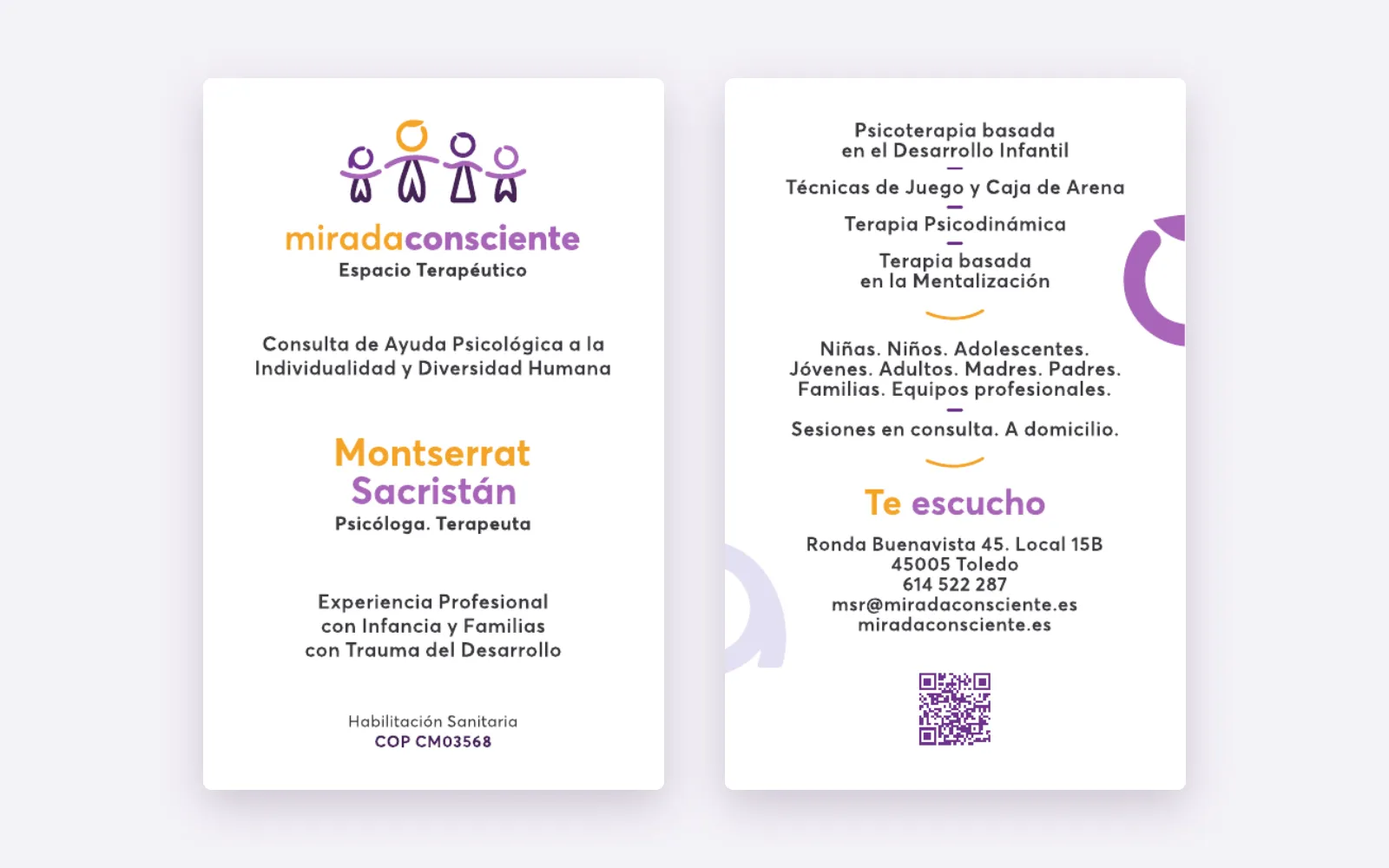
The four figures answer a different question, which is who comes through the door. On the back of the card the practice lists who it works with: girls, boys, adolescents, young people, mothers, fathers, families. The work is never only with the child. Four figures of different heights, holding hands, show that system in one line, and the hands carry the theme of the practice without a word of jargon: attachment is literally the thing that holds them together.
The heads are open rings. Not closed circles, because nobody in that room is finished. The same rings come back as large shapes on the back of the card and as the quiet ornament of the brand, next to the line that runs through the card and the website: “Te escucho”. I’m listening.
Colour and type
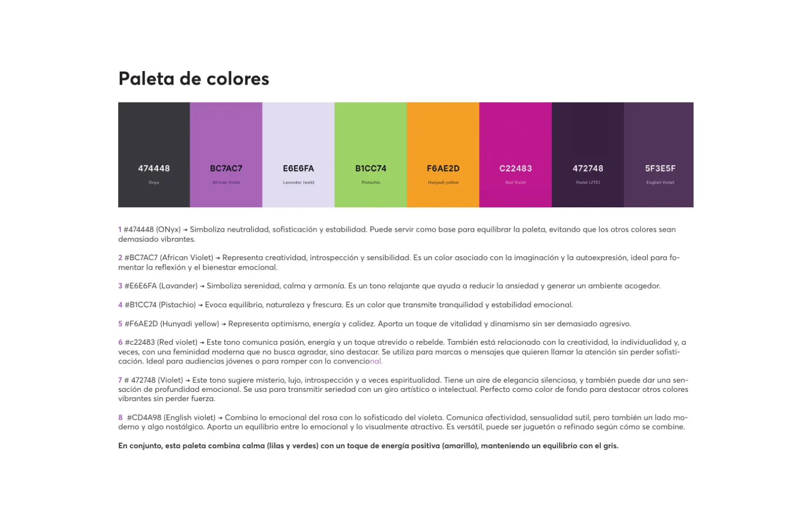
Eight colours, each with a stated job. Lavender for calm, African violet for introspection, a deep violet for depth and for dark backgrounds, pistachio for balance, a warm yellow for optimism, a neutral grey to hold everything down. Red violet was there for energy and a younger audience. One colour from the first sheet didn’t survive: a muted English violet was replaced by a warmer, more emotional tone.
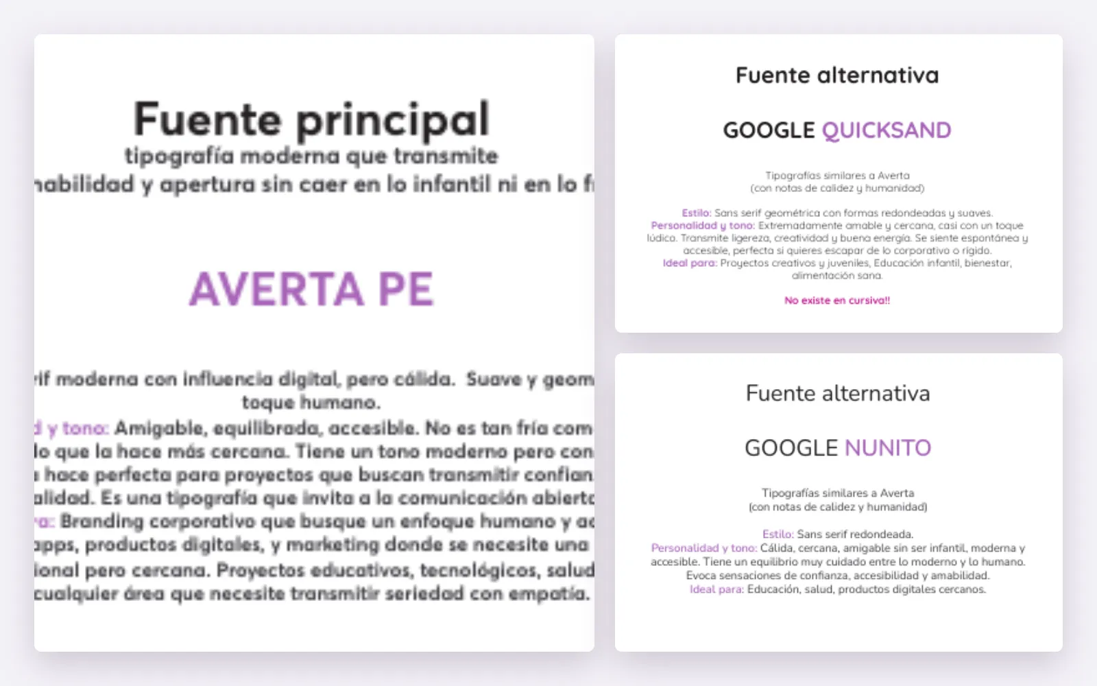
The typeface is Averta. I tested it against Quicksand and Nunito, both free and both friendly. Quicksand turned out too playful for a clinical practice, and it has no italics, which the early cards relied on. Averta stays friendly without becoming childish or cold, which was the whole brief in one sentence.
The business card went through twelve versions between April and May 2025. That sounds like a lot for 85 by 55 millimetres. Along the way the logo changed once completely, the address changed, and so did one line that matters more than it looks: the professional title.
Words that have to be exact
In health, wording is not style. It’s the law, and it’s trust.
Early drafts said “specialised in”. In Spain, specialist is a regulated title, so every page now says “with experience in”. The website went through the same correction before launch: one draft used a title that requires a specific master’s degree, and the final version says what is true, “Psicóloga Habilitada y Colegiada”, with the registration number. She also works at a large private hospital in Toledo. The site says she collaborates there, not that she is part of their team, and it never implies their endorsement.
None of this is visible to a parent. All of it would be visible to a colleague, a regulator, or an AI assistant deciding whether to trust the page.
The website
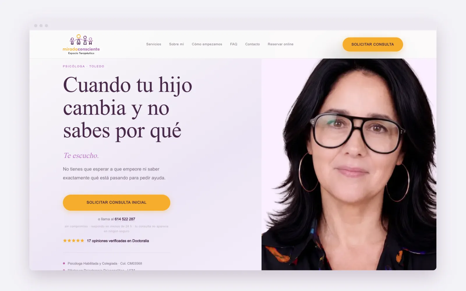
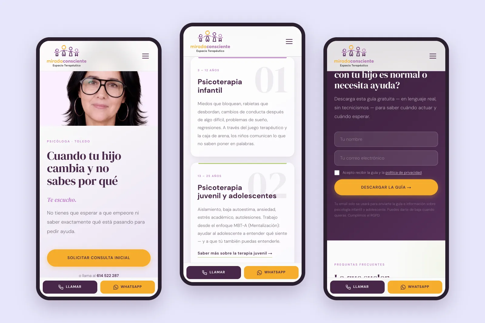
The website followed a year after the brand, in June 2026. Its home page runs in the order a worried parent thinks. First the recognition, “Cuando tu hijo cambia y no sabes por qué”, when your child changes and you don’t know why. Then who she is, then the four areas of work, each with its own page, then a free guide for parents who aren’t ready to call, then the questions people ask before a first session, then the way in.
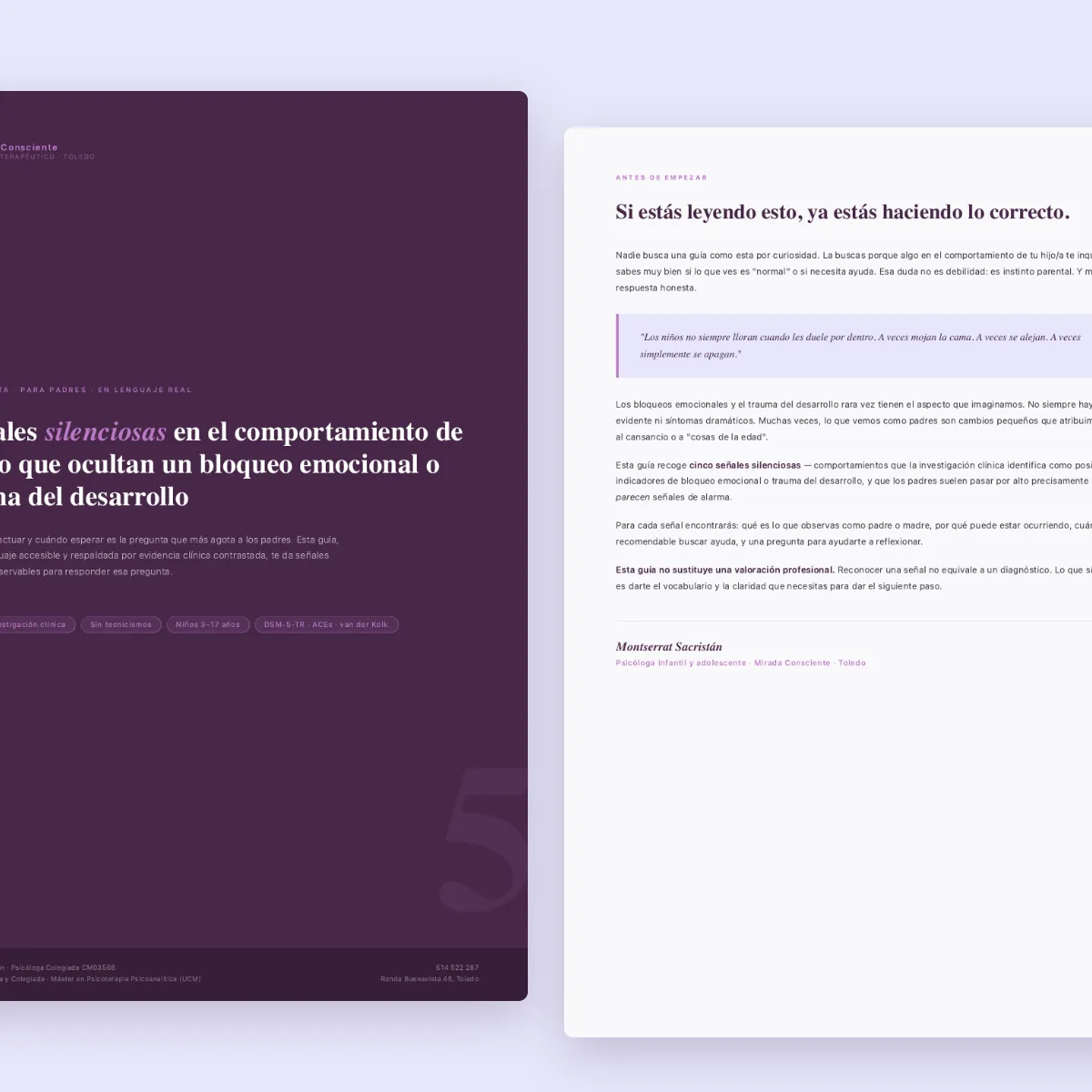
The guide, “five silent signs”, is the honest middle step. A parent leaves a name and an email, gets ten pages written for them, not for colleagues, and the last page offers a first consultation. Booking runs through WhatsApp, a phone call or the practice’s online calendar, and a bar at the bottom of every phone screen keeps the first two within reach.
The sand-tray images on the site are generated, not photographed. Therapy sessions with children can’t be photographed, and staged ones would be worse than none.
What went wrong
The first contact form sent nothing. It looked fine, it said thank you, and the messages went nowhere. I found it before launch and rebuilt it on the email platform that also delivers the guide.
The booking calendar from the appointment platform weighed about a megabyte and made the page slow on phones. It now loads only when a visitor scrolls near it, and the mobile speed score went from 57 to 91.
For a while, the guide could be downloaded straight from Google, without leaving an email. It’s now hidden from search engines, so it reaches parents through the page that explains it.
Measured, not claimed
Since launch a small tracker records how the practice shows up in Google, in Bing and in AI assistants, every day. On 19 October 2026 I asked ChatGPT, Claude, Gemini and Perplexity the same questions a parent would ask, in Spanish, and checked every answer by hand.
- Asked for the practice or the psychologist by name, all four assistants identify her.
- Asked for a child or adolescent psychologist in Toledo, eight questions per assistant, the practice comes up in 8 of 32 answers, and all 8 link straight to the website.
- Asked the same without a town, “child psychologist” anywhere, it comes up in none. For a local practice that’s the right answer.
- Gemini, measured daily since June, named the practice once in 47 answers to the six general Toledo questions in June, and in about one answer in five since July, most often when the question was about teenagers. For the two specialist questions, sand tray therapy and developmental trauma in Toledo, it has named her in 161 of 167 answers since they were added in July.
- In Google, the practice was first for sand tray therapy for children in Toledo at the last rank check, on 20 September.
The limits belong next to the numbers. AI answers change from day to day: Perplexity named the practice for one of the eight Toledo questions on 19 October and for none a week later, while Gemini, asked the same eight every day, names it three or four times. The assistants were queried automatically rather than through their apps, which comes close to what a parent sees but isn’t identical to one parent on one phone. The question with only the name, “Mirada Consciente”, I didn’t count: three assistants explained the Spanish phrase instead, and one found a different team with the same name. And the search volumes are small, because this is one practice in one city, not a chain.
One thing sits outside the website altogether. The hosting provider blocks OpenAI’s training crawler, while the crawler behind ChatGPT’s search gets through and has visited the site more than 600 times since July. That’s a setting at the host, and it’s on the list.
On method
The research ran through AI tools, the first logo sketches started as AI proposals, and the website was built with an AI coding agent. None of that decided anything. The eye was dropped because of a child in a consulting room, the titles were corrected because of a regulator, and the guide sits in the middle because a parent at midnight isn’t ready to call.
A practice like this doesn’t need to look like a clinic. It needs to look like the person who will answer the phone.
A child who is brought to therapy is looked at all day. The logo shows who comes along.
Have a project like this one?
Tell me what you're planning. I'll tell you honestly whether I can help, and what it would take.
Tell me your project →You'll deal with me directly, from first call to final delivery.